Gabrielė Oržekauskaitė

ux/ui designer

front-end developer

digital artist

>captivated by worlds and connections within

generating perspectives

assembling solutions</
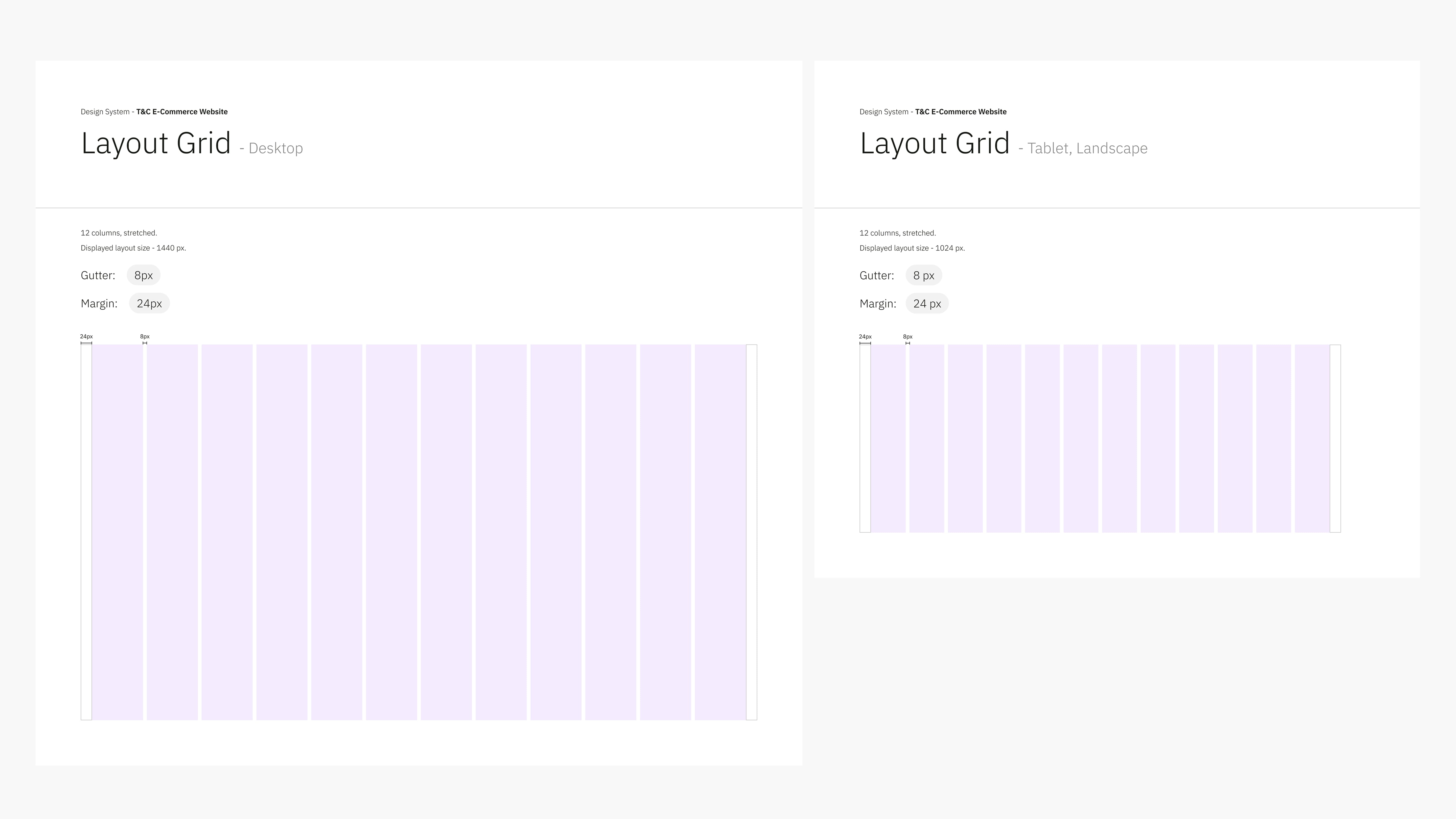
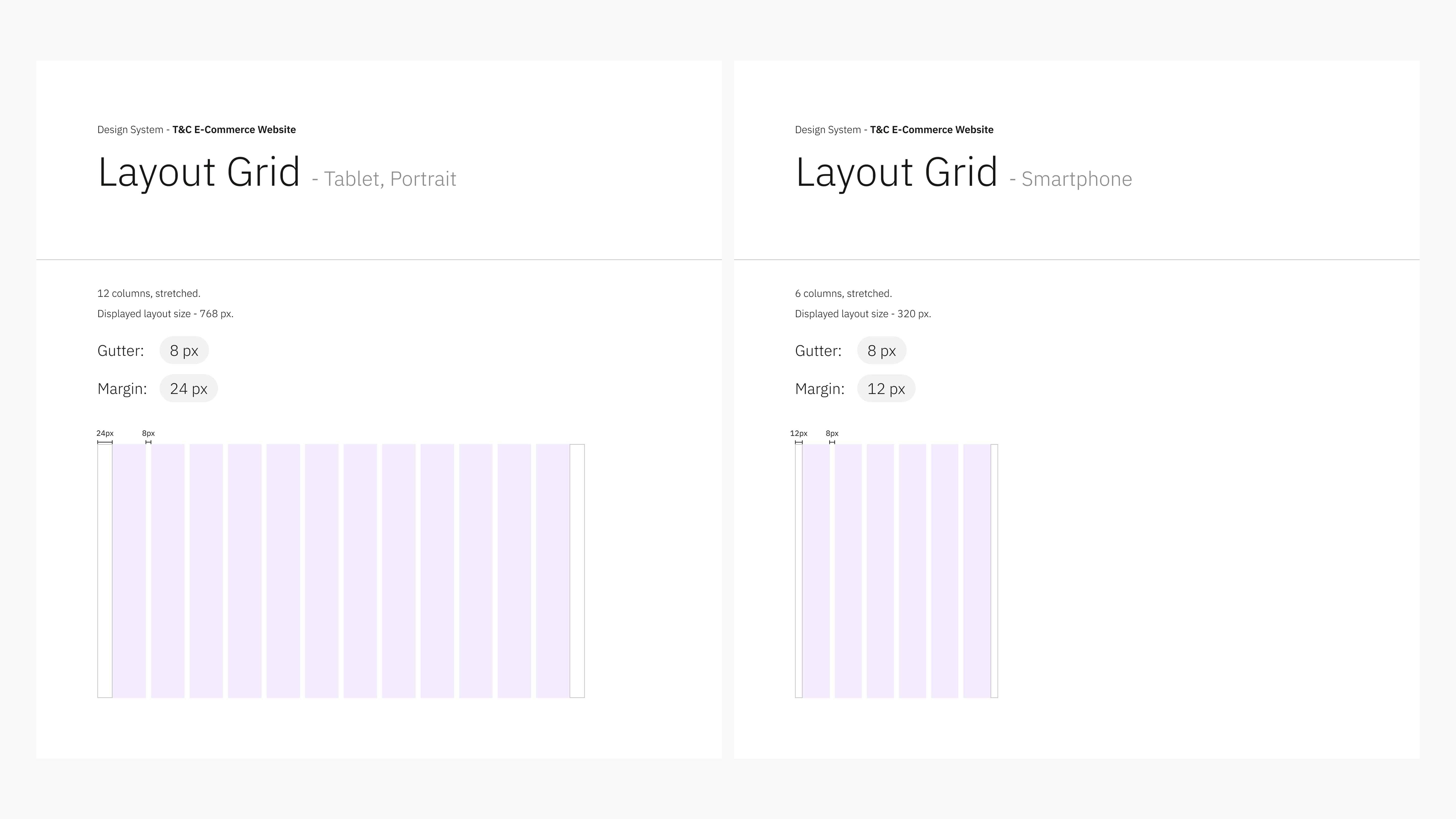
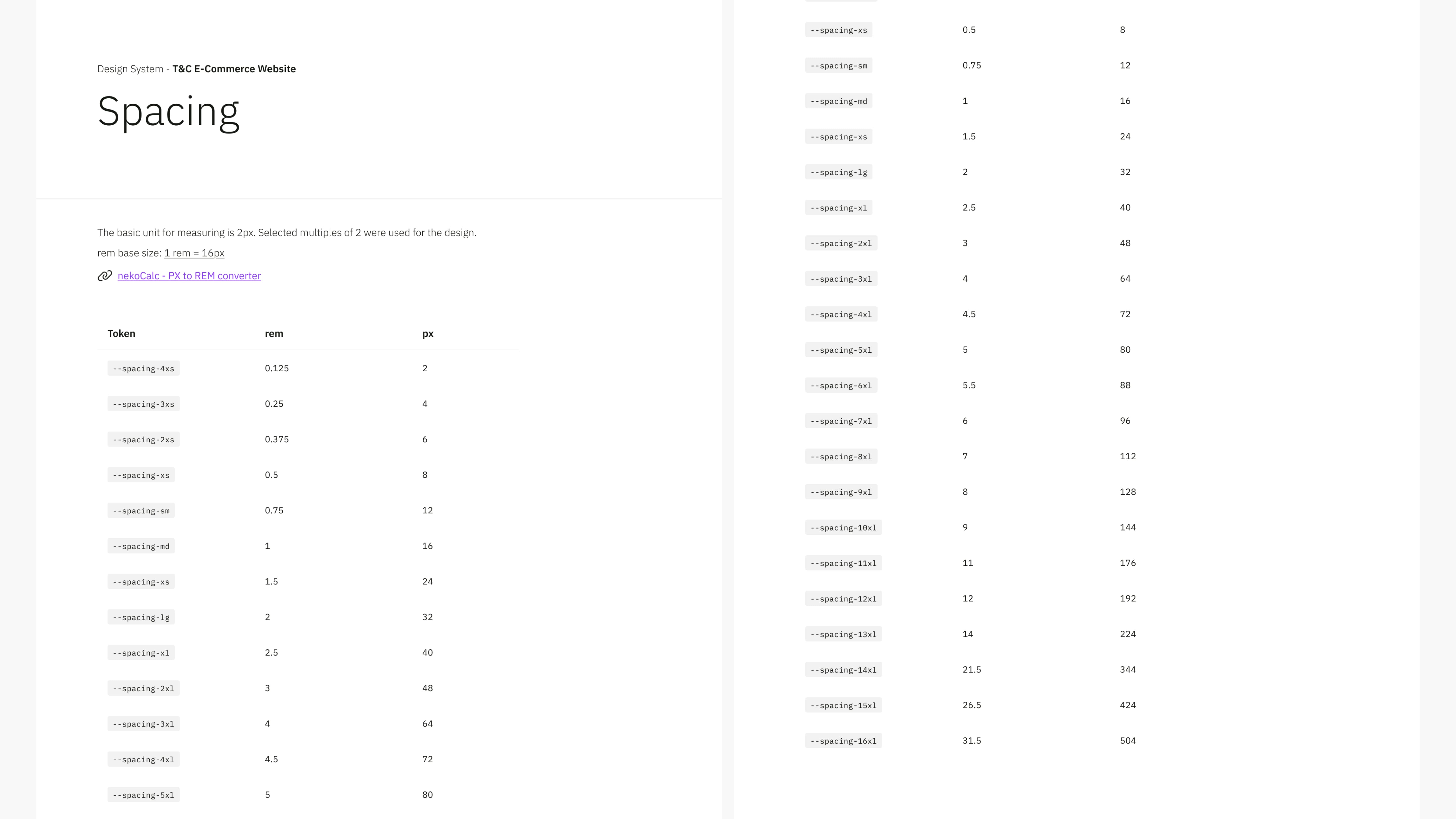
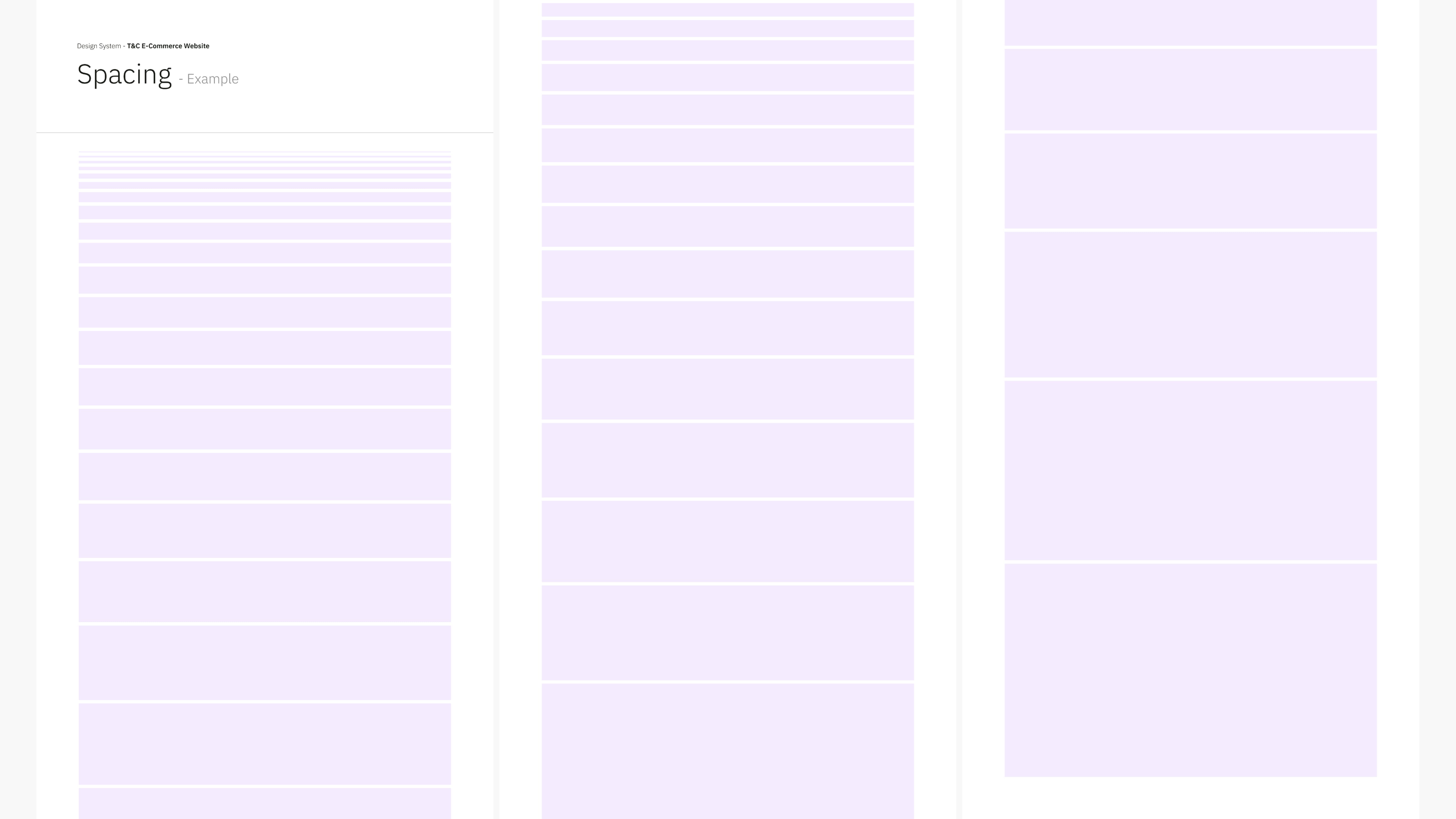
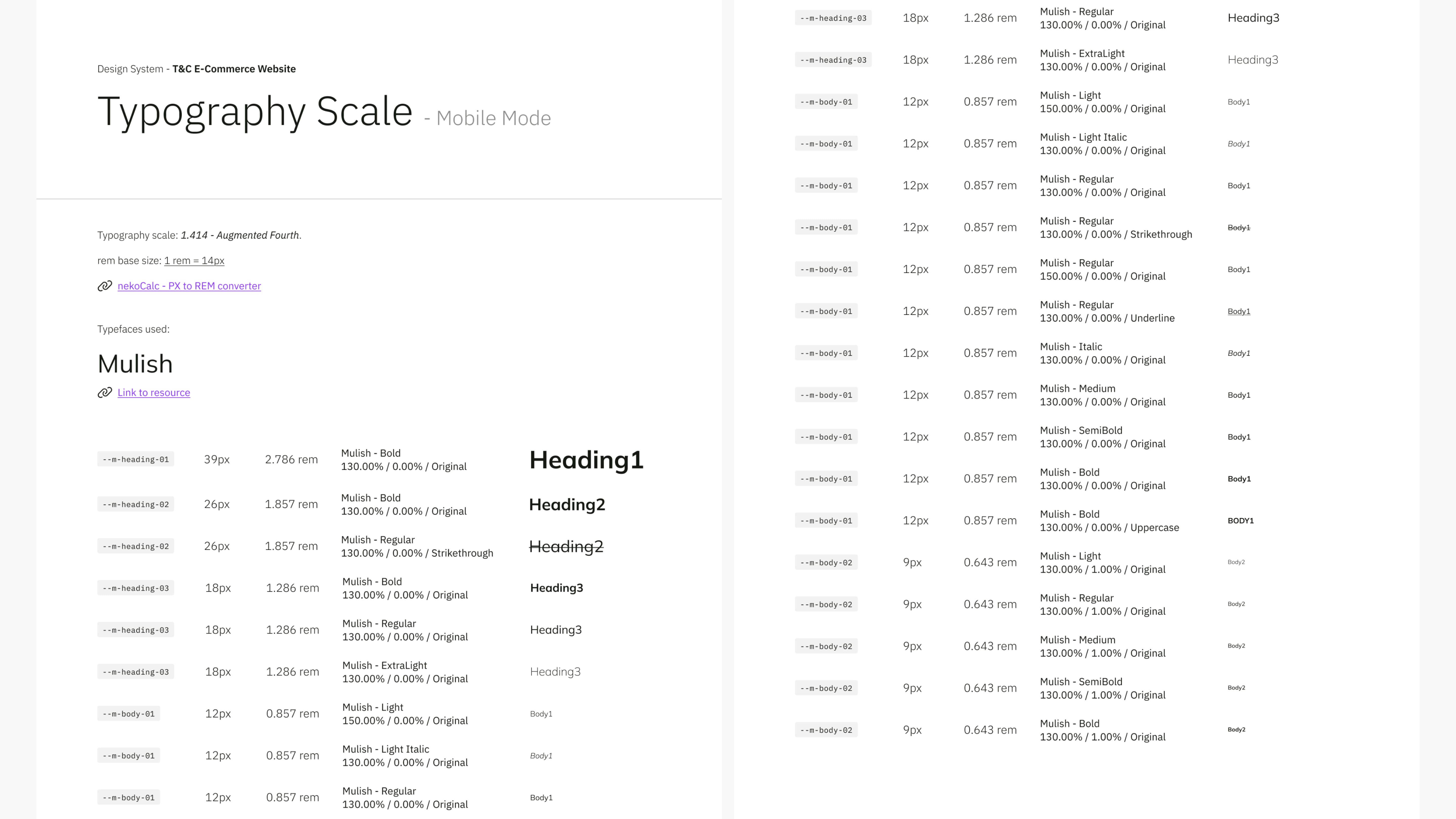
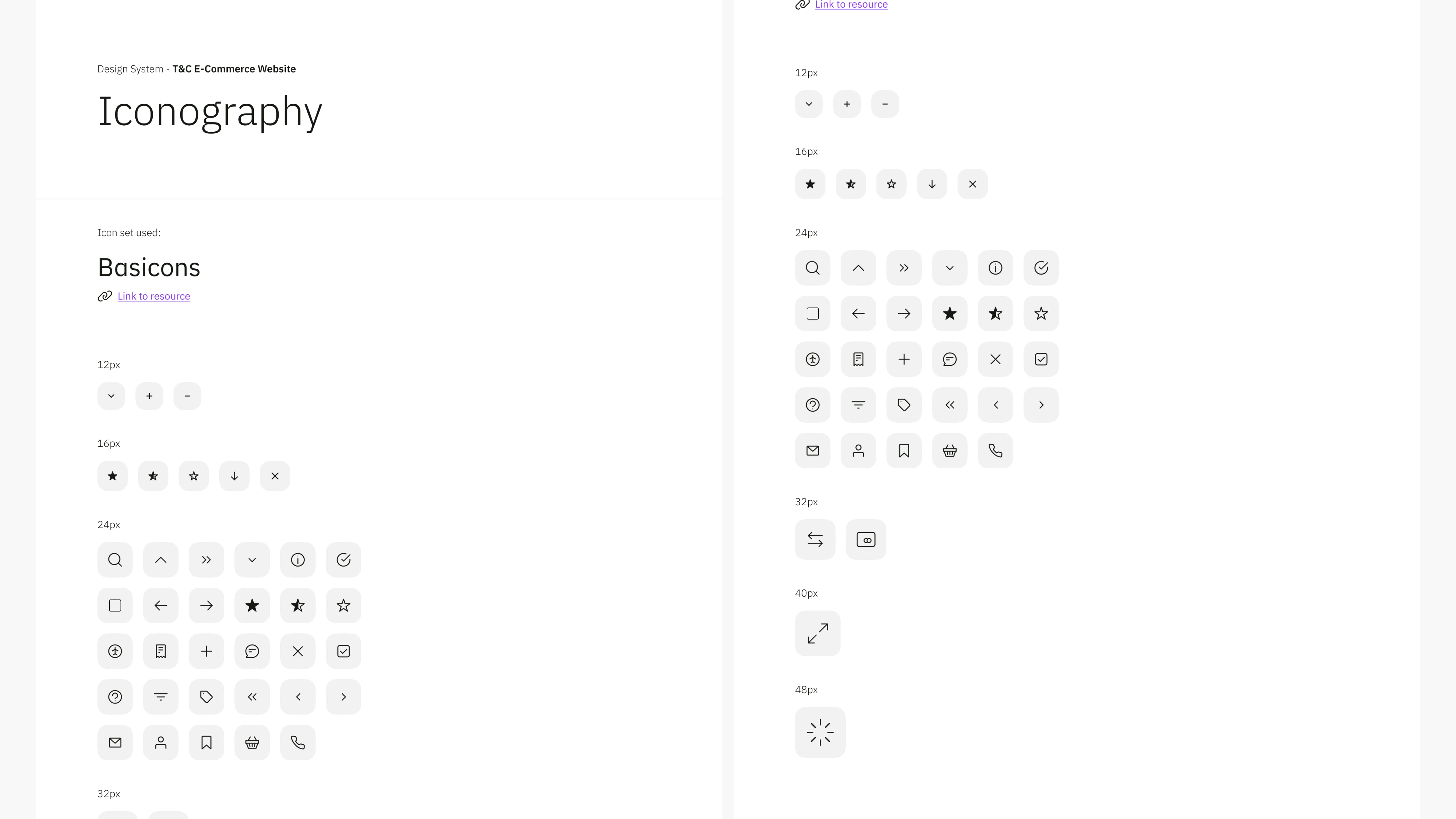
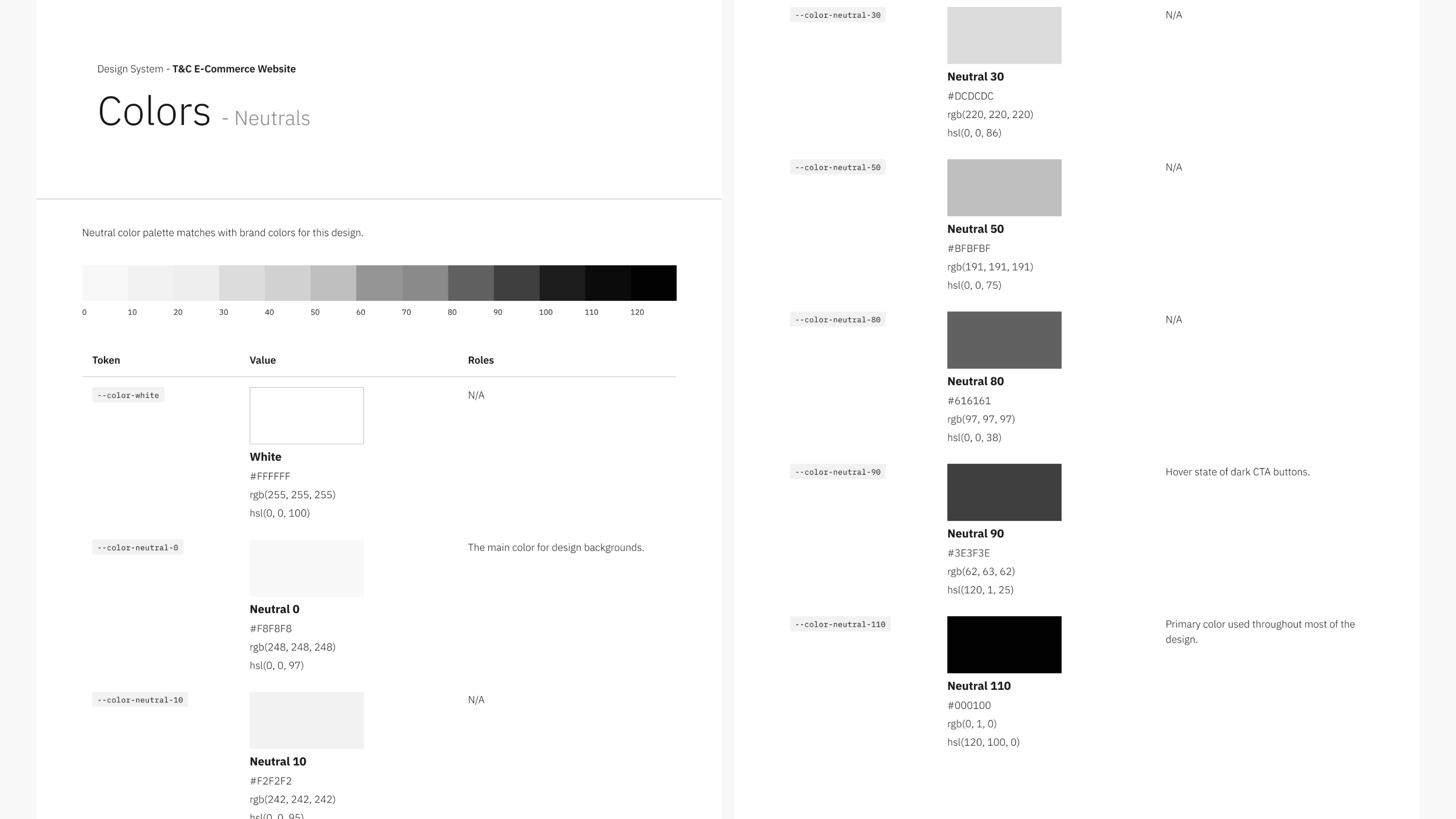
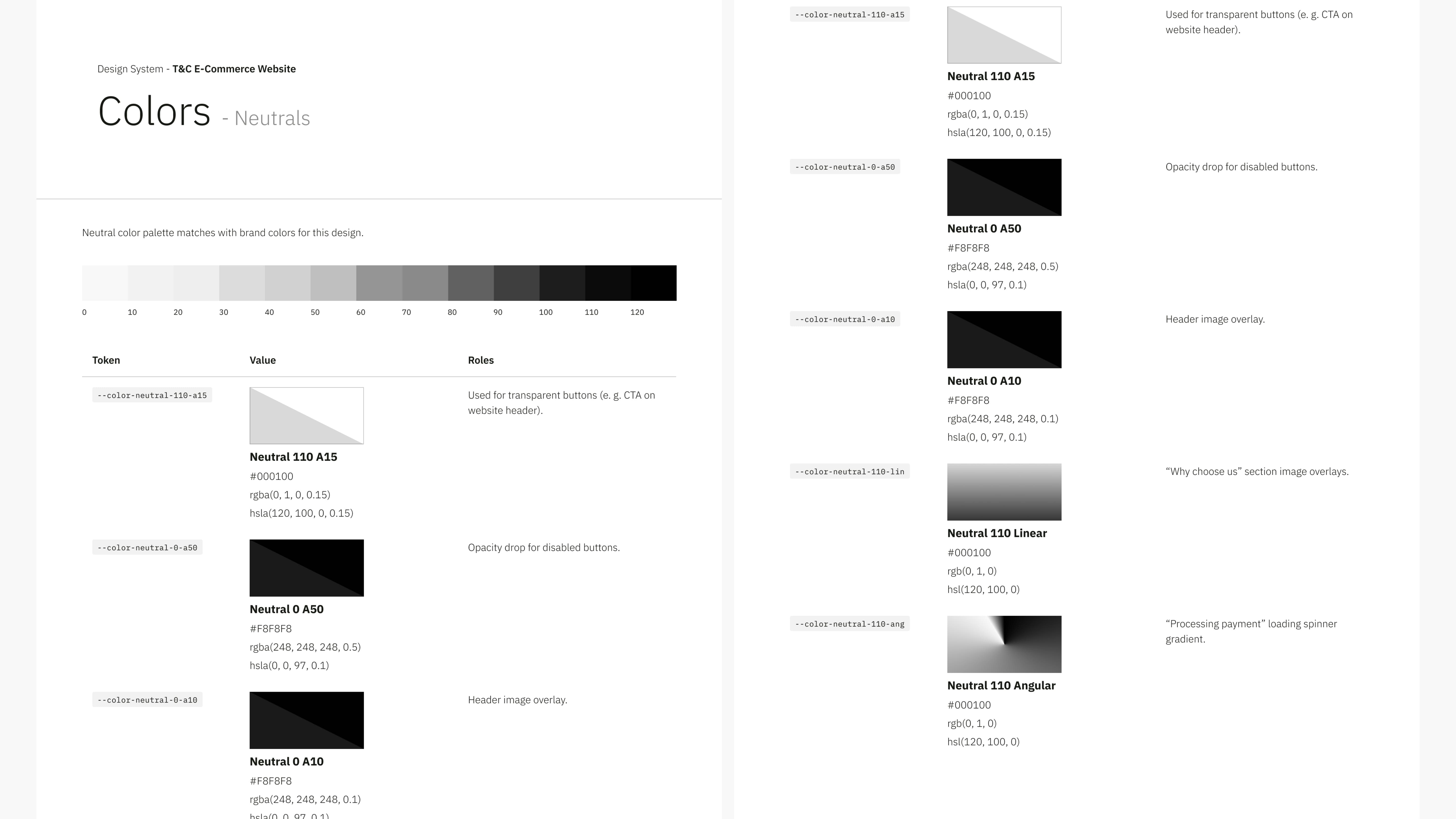
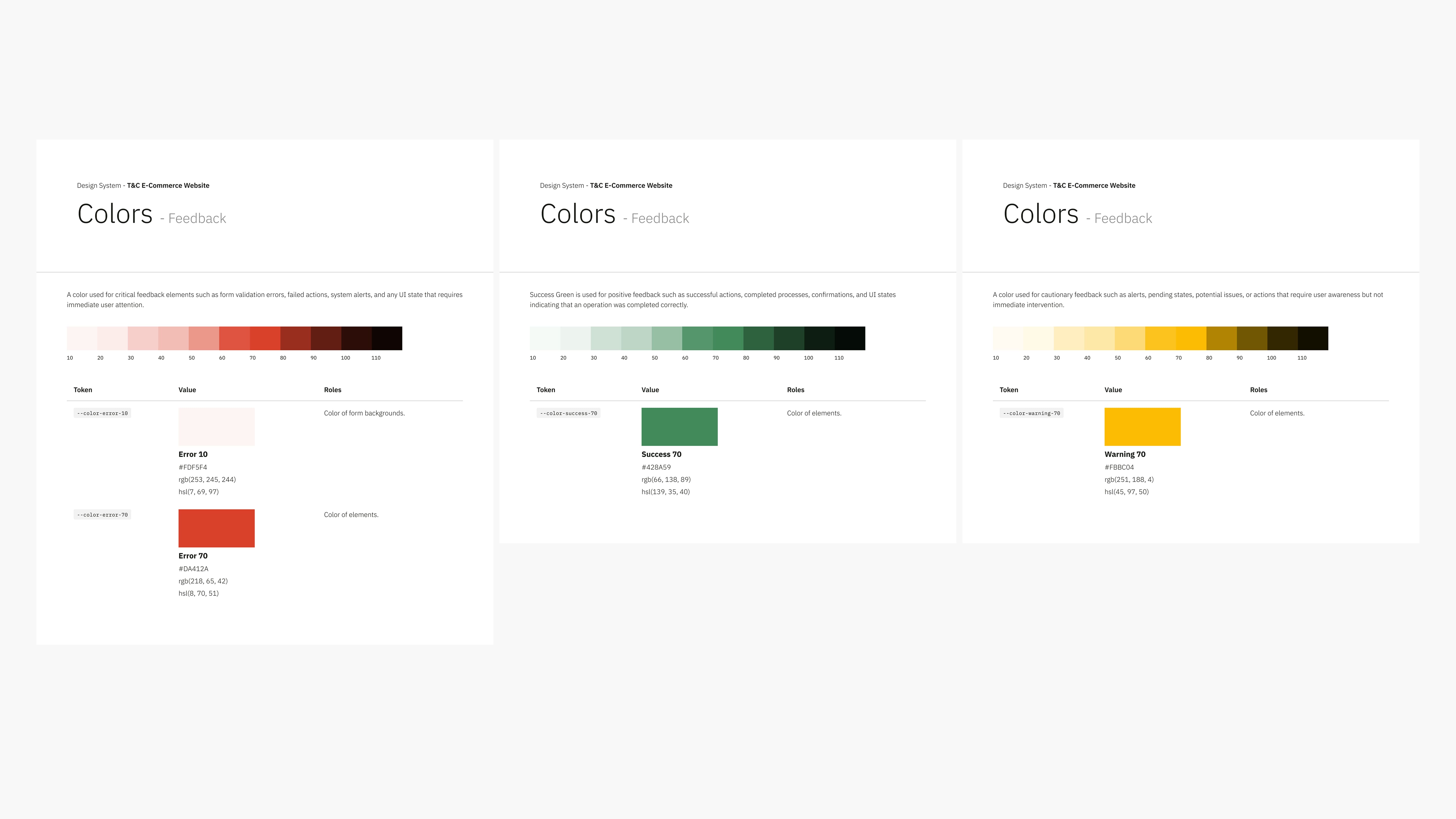
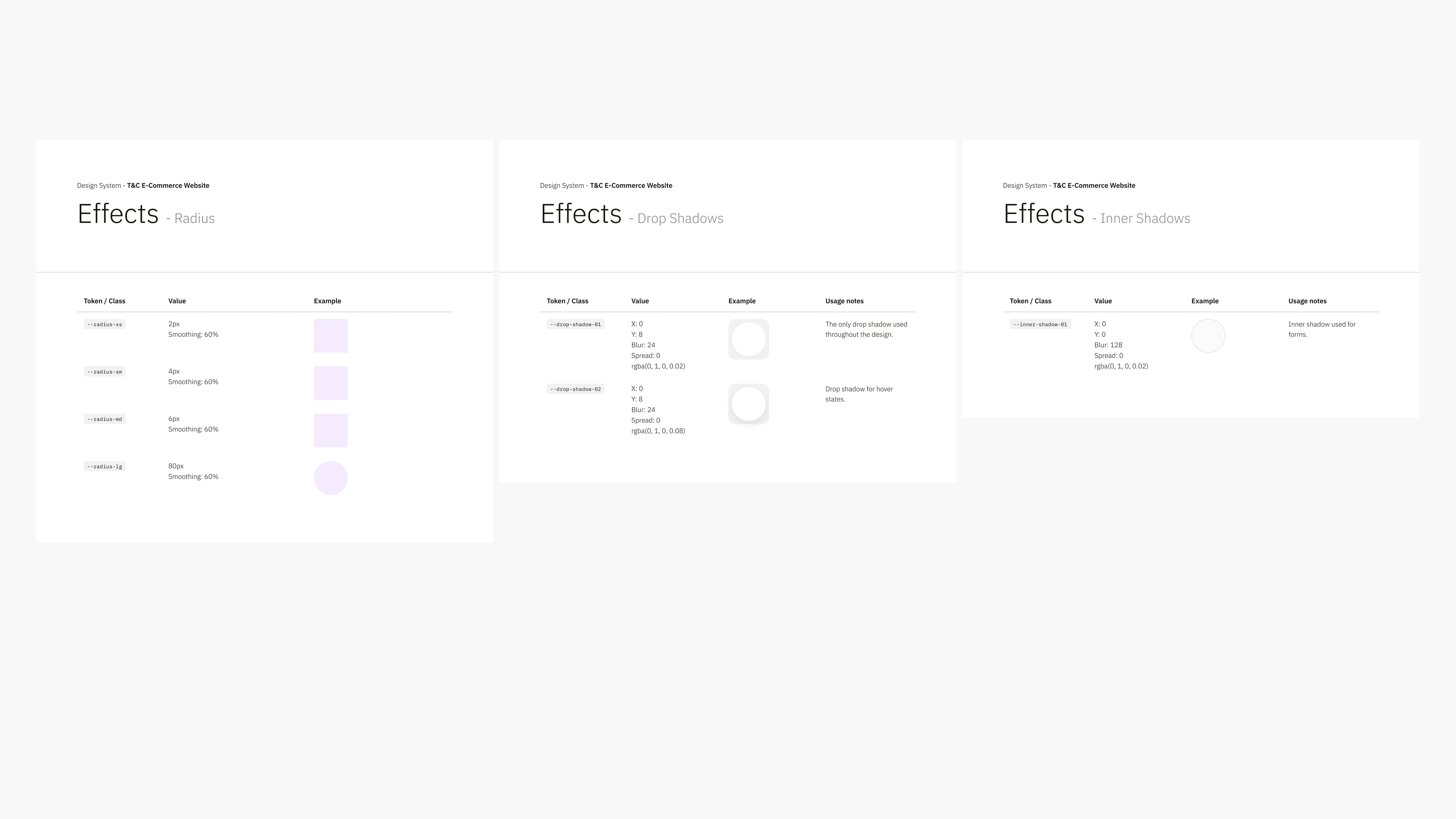
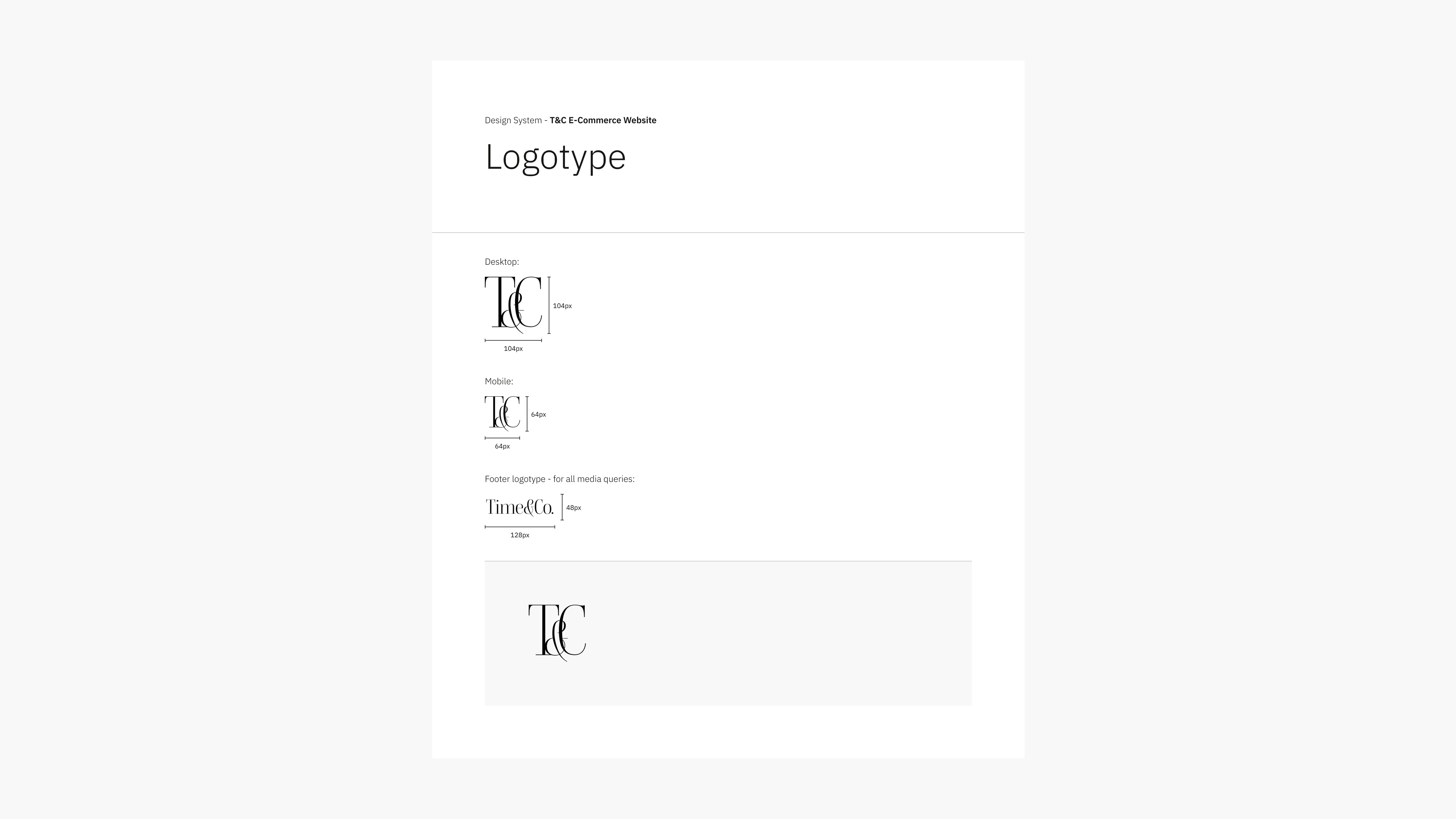
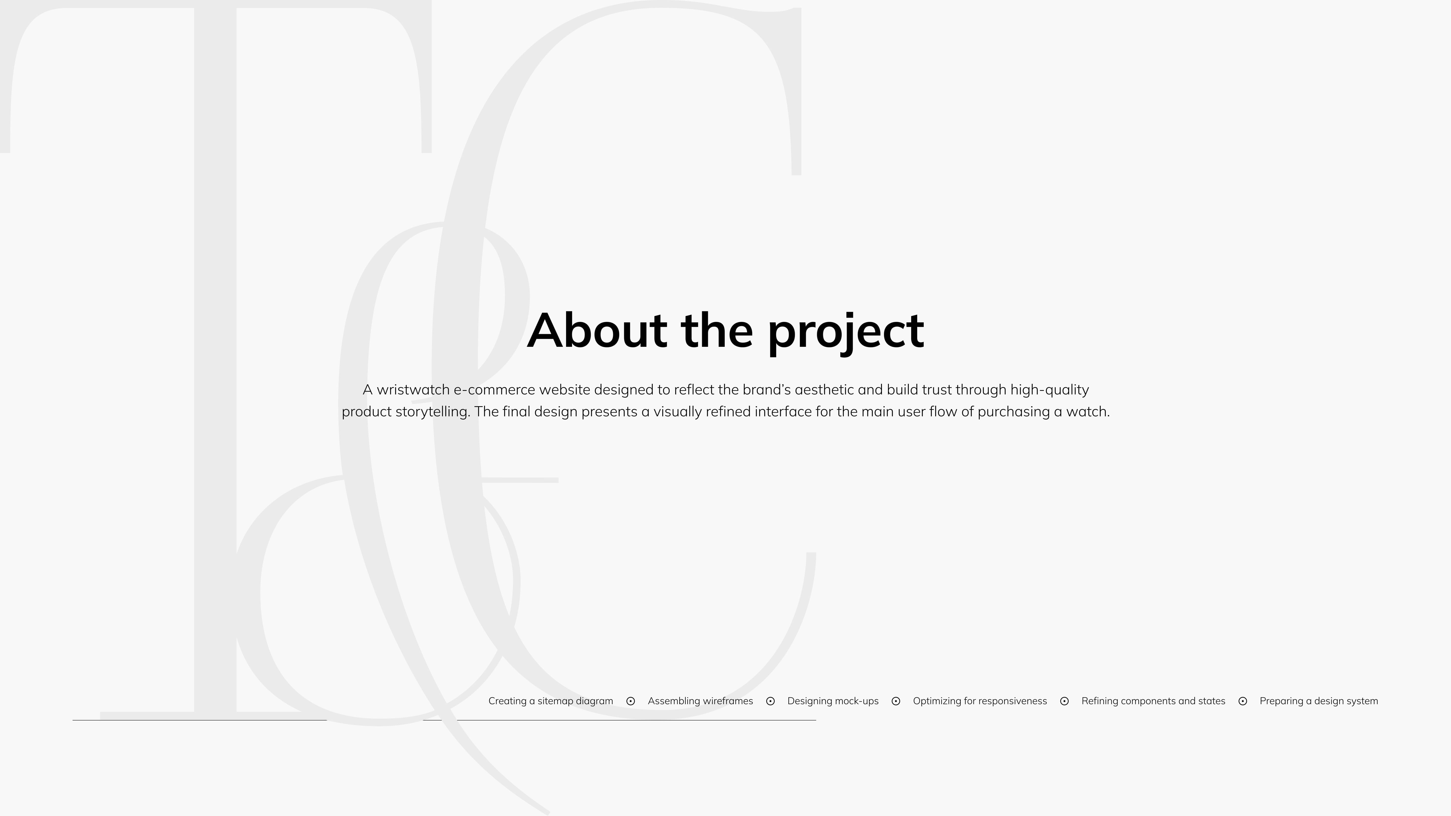
Time & Co.

A design process presentation for a wristwatch e-commerce platform with an applied visual identity.

Click the arrows to browse screens from the design system.

Split image showing two layout grids titled 'Layout Grid - Desktop' and 'Layout Grid - Tablet, Landscape.' Each has columns in pale purple, illustrating responsive design. Comparison of layout grids for tablet in portrait orientation and smartphone. Features include margin, gutter, and height settings, with purple grid columns. Image of a webpage titled 'Spacing' featuring a table. The table lists terms with numerical values in px and rem. Simplistic and minimal design. Three vertical columns display different spacing heights of purple rectangles on a white background. The title 'Spacing - Example' appears in the top left. Typography scale chart in desktop mode, showcasing various font sizes, line heights, and styles using the Mulish typeface. The page is divided into columns with text aligned in different sizes and weights, providing a structured overview of typographic hierarchy. Typography scale for mobile mode displayed with font family Mulish. Lists multiple font sizes, weights, and styles, highlighting headings and body text. Screen displaying an iconography guide titled 'Basicons' with various basic icons like arrows, stars, and symbols arranged in a grid. Minimalist design. A detailed color chart titled 'Colors - Neutrals' displays a gradient of neutral tones from white to black. Each shade has its RGB and HEX values. Neutral color palette chart displaying gradients from white to black. Includes hex codes and descriptions for each shade. Clean and minimal design. Three panels display color scales. The left has shades of red, the center shows greens, and the right features yellows. Each panel includes labeled swatches. Image displays three tables titled 'Effects' with subcategories: Radius, Drop Shadows, and Inner Shadows. Each table lists effect names, notes, and previews. A minimalist logo design screen displaying variations of a 'T&C' logotype. It features different sizes of the logotypes used for the website design.